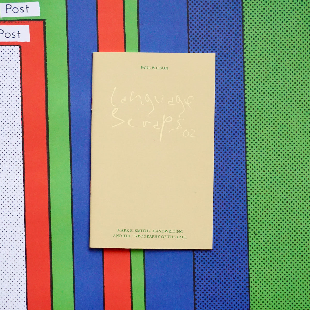
LANGUAGE SCRAPS 02: MARK E. SMITH’S HANDWRITING AND THE TYPOGRAPHY OF THE FALL by Paul Wilson
In this essay Paul Wilson views The Fall through a typographic lens and explores their visual identity as propelled and produced by Mark E. Smith.
“Mark E. Smith’s handwriting became part of The Fall’s visual identity: a typographic signifier of and for The Fall. His attitude towards the development and articulation of a visual identity for The Fall, and in particular the use of his handwriting, reflects his position towards The Fall’s sonic identity. Further, his ambivalence towards contemporary technologies (of sound recording, communication and graphic design), together with his fascination with the idea of creative unwinding (or as he often calls it ‘unlearning’) continually relocates The Fall’s aesthetic tending towards an idealized primitivism.”
This essay was first published in Mark E. Smith and The Fall: Art, Music and Politics (2010) published by Routledge. Edited, updated and represented between March and May of 2021.
-
Title
Language Scraps 02: Mark E. Smith's Handwriting and the Typography of the Fall
-
Author / Editor
Paul Wilson
-
Publisher
The Grass is Green in the Fields for You
-
Pages
36
-
Dimensions
120 x 180mm
-
Format
Pamphlet
-
Year
2021
Shipping Terms
Recommended last orders
United Kingdom: Tuesday 17 December
We highly recommend placing orders for Christmas as early as you can.
Delivery
We aim to process orders within 1–2 working days. Orders placed on a Saturday and Sunday will be processed from the next working day. If you need something in a hurry please call or email us before placing an order to ensure the item is in stock.
UK
All mainland UK orders are sent using Royal Mail, which usually arrives within 1–2 working days after despatch. We use Parcelforce and DHL on heavier or bulkier orders, which can take 2 working days to arrive. Royal Mail Signed For, Parcelforce and DHL all require a signature as proof of delivery. Please note that postage costs for addresses that are not mainland UK may vary.
European Union and Single Market
Please note that due to the introduction of the General Product Safety Regulation (GPSR) in December 2024, we are no longer able to ship to the EU and Single Market (including Northern Ireland). This does not affect items such as workshop bookings, Studio Passes, or Gift Vouchers.
International
Please note that LCBA cannot be held responsible for any import duties, taxes or delays in processing once your order arrives in-country. It is important that international orders include a contact telephone number and email address at checkout in the instance that the carrier needs to contact you for taxes and/or duties to be paid.
Out of Stock
We make every effort to ensure all products are in stock, but in the event of us not having your chosen product we will contact you and offer either a refund or a split- or later delivery if possible.
Returns
We hope you are happy with your purchases from London Centre for Book Arts, but if not, we can offer a refund on any item as long as it is returned in a saleable condition within 30 days of receiving your item. Please note that we are unable to reimburse postage costs for returns. For further information, or to make a return, write to us atorders@londonbookarts.org.